Wednesday, 30 June 2010

Music video analysis


Analysis of Lady Gaga - Just Dance

This music video contains approximately 192 shots throughout, 105 of these are 'Meat shots' where the artist (or main artist if in a band) are the main focus of the shot.
This video uses a large amount of medium shots, these show the storyline or events of the music video while focusing on Lady gaga as the main artist. This video cross cuts between footage of the party scene and lady gaga dancing and singing the lyrics throughout the music video. The video uses high angles to reveal people on the floor. this shows lack of power, while when the low angle is used to look up at lady gaga, this shows how she contrasts with the other people at the party as she is superior in comparison to them. At the star of the video, someone is carrying a music player and is shown to be pressing the 'play' button. However this is shot using canted framing to show that something about the frame or video is unusual. The video also uses contrasts in lighting, the start of the video uses bright lighting, this could relate to the time of the party that this is earlier on in the night as the more the video goes on the darker the lighting gets, again possible in relation to the progression in time.
The speed of this song relates to the video as when the sound in the song speeds up, the video footage has been edited together faster. However most of the song is fairly fast paced and quickly edited together, the shots of the fast paced part of the video are in the second set of screen grabs.
The video relates to the music as the song is about a party and dancing, these images are illustrated in the music video.This song is taked from Lady gaga's first album, the icons of this video are lightning bolt and disco ball, these images are used in throughout the video.

Analysis of a music video using Prezi

Thursday, 24 June 2010

Album cover deconstruction

Kanye West's - graduation album is interesting because of the images used, the cartoon bear on the album cover has been used on most of Kanye West's albums, this is a reoccurring theme throughout a lot of his album covers. The title of the album relates to the images as the title is 'Graduation' and graduation hats are in mid-air in the background of the picture, where other cartoon animals are in the role of cheerleaders, and some are wearing the traditional graduation robe outfit, the theme of the album cover is mainly that of the American college experience. The colours on this cover are all bright and seem to be surreal, however the background has been created with clouds which accompanies the bear flying throughout the air. The text is large and the font is colourful to fit with the album sleeve's theme. The text and the images relate to each other as the pictures all relate to an American college 'Graduation'. These work together to make the theme of the album clear and successfully market the album. The back cover of the CD continues with the themes of the bear, the cartoon in the bottom corner and the bright bold colours. The album was designed by Takashi Murakami who designs characters that appear to be friendly at first glance, but the more you look at them they reveal darker undertones. The inner sleeves continue with the city life where the cartoon bear is being running into the final image of a graduation, recognisable by people wearing graduation hats. The front sleeve is designed to advertise the new album to increase sales, the back cover of the album is designed to show all of the songs on the album and give details of the production and recording companies, while the inner sleeves are made more to fit with the topic and story of the album. There is iconography on this album's sleeve as while there isn't a picture of Kanye west on the sleeve, the bear is associated with him as it has been on most of his album's covers to date. The album cover represents the genre as typically the r n b rap genre would not be something associated with graduating college, however this is challenged on the cover of this album. Additionally the design was created by an artist, a concept of this album could be not to have any real images on the album sleeve. This album is the third album released by Kanye West, so this album will be aimed at the target audience of his fans who liked his previous albums. Kanye West is a mainstream artist as he is well known and his songs are often chart music.

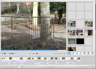
IMovie and Final Cut screen grabs


These screen grabs show Imovie and Final Cut, both of which i have used to edit my AS level work and my A2 prelimenary task.

Monday, 21 June 2010

Album cover artwork

Typical features of an album cover
The typical features of an album cover is a picture of the artist or band, the name of the album, or an image or cartoon which relates to the artist or the album' s name.
Categorise the album covers
These four album covers are different genres, Kanye west - graduation is rap, and on this album cover is a cartoon bear that reoccurs on most of Kanye west's albums, Taking Back Sunday - tell all your friends is indie this picture on the album doesn't relate to the artist or the song title, Lady gaga - the fame is chart pop, the picture on the album cover is a close up on Lady Gaga with the title of the album written on her sunglasses, and The human league is new wave with a picture of the band on the front of the greatest hits album.
Function of the album covers
The album covers are usually made to be easily recognised by the audience and fans, additionally they are designed to advertise the artist when they release the new album, it is the covers that are remembered by the fans.